Guidelines for publication-quality figuresFigures are probably the most important part of the scientific paper: many readers of your paper will likely read the abstract and glance at the figures to decide whether the paper is worth reading / citing. Therefore, good selection and good presentation of figures is of outmost importance in conveying your results. Figure choice: Figures are precious. Use them sparingly. If you make 70 figures for your project, choose the best 10% for your paper. Figure selection defines your main scientific result. On this page there is the following information:
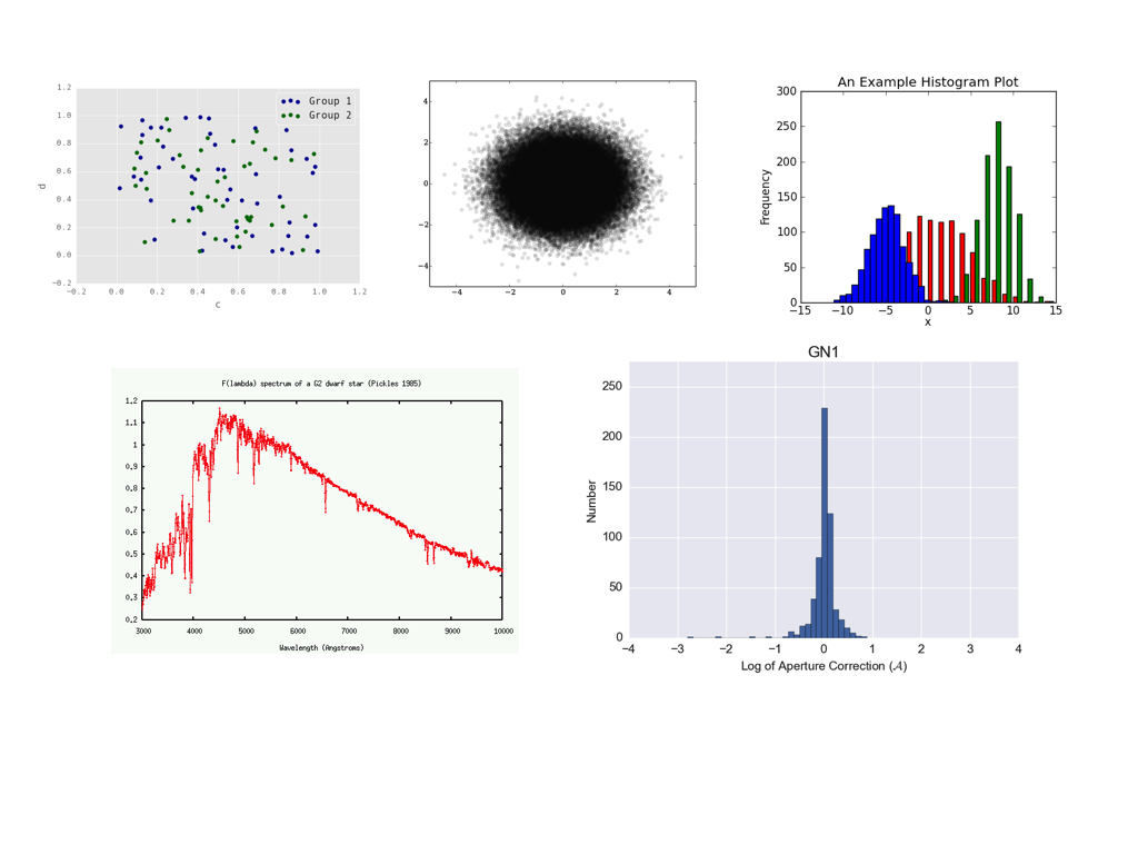
Basic checklist for all figures in the paper in prep.Check your figures: Compile your paper in the journal format and check that your figures satisfy these guidelines. While these guidelines are not absolute rules, if you are violating them you must have a good reason. Below, I am showing some plots; they all have problems and are not publication-ready. Captions: Every figure must have a caption that explains the styles and colors of this figure. If your quasars are blue and galaxies are red, either have a legend or a sentence in the caption (repeating in both the legend and the caption is not necessary; repeating this in the main text is certainly not necessary). Avoid referencing other figures, e.g., instead of "Colors are as in Figure 1" either add the legend or say that quasars are blue and galaxies are red. No verbs in the first sentence of the caption, e.g., "Figure 1: The distribution of galaxy sizes in our sample. We find that galaxies (red) are bigger on the sky than quasars (blue)." Labels: Every axis must have a label (exceptions for multi-panel images with joint axes). Bonus for descriptive labels: instead of "N" say "number of objects", instead of "c" say "concentration parameter" or "conc. par.". Every label must have units (exceptions for dimensionless values). Top "header" labels are not allowed by the journal. Legends are not a requirement, but can be helpful. All extraneous information (e.g., some values you displayed for your own records) must be removed. Check that your tick labels do not overlap (this frequently happens for multi-panel plots or at the bottom left corner); if they do, adjust the plot range or panel spacing until they don't or fiddle with the tick labeling. For values that must be displayed on the logarithmic scale, I prefer logarithmic ticks: i.e., instead of ticks that show 43, 44, 45 and log L(IR) [erg s^{-1}] as the axis label, I like 10^43, 10^44, 10^45 and L(IR) [erg s^{-1}]. The most recent python upgrade made right and top axes tick-less by default. We need ticks on all axes. This is achieved by setting plt.rcParams['xtick.top'] = True and plt.rcParams['ytick.right'] = True Font sizes: Most single-panel figures will be at the width of one journal column (half the width of the page). All fonts in the figure should be at least as big as the font in the figure caption (this is a journal requirement), and ideally as big as the font of the regular article text. Bonus for uniformity of label sizes and styles across the article. Default python fonts are too small. Consider making your default font sizes in python 50-100% bigger to avoid this problem once and for all. Font styles: The notation in the figures must be exactly the same as in the text. If in the text you use \nuL_{\nu}[8\micron] for the infrared luminosity in LaTeX, then your axis label should be exactly the same (with erg s^{-1} added), not L_{IR}, L_8, nor something else. Proper use of LaTeX is necessary (e.g., a properly displayed \lambda instead of lambda). Watch for unnecessary italics: if you use subscripts, then they are often italicized by default, so use L_{\rm IR} instead of L_{IR}. Contrast: Background should be white (not grey or beige) for better contrast. Grid lines are acceptable, but uncommon and usually unnecessary. Use thicker lines and heavier and bigger points for better visibility. If you have points that blend into one blob (see example below), consider instead (i) alpha=[small value] for greater translucency; (ii) smaller point sizes; (iii) contour plots; (iv) 2D histograms. Uniformity / self-consistency: If you use log L(IR) [erg s^{-1}] with linear axis ticks on one plot, then use the same thing for all plots, not Lsun, not logarithmic ticks. If you use blue for quasars and red for galaxies on one plot, don't make quasars orange or stars blue on another plot. If you have two panels that involve L(IR) side by side, then make L(IR) the vertical axis on both (and not for example horizontal on one and vertical on the other). If you have one plot where L(IR) runs from 10^42 to 10^45, don't make it run from 10^41 to 10^44 on the next one. Use fig.tight_layout() to spread out the panels so that they don't crowd each other out or squeeze the labels. Colors: choose contrasting colors for different populations of points on the plots. Blue / green are often not contrasting enough (see below). Remember that 10% of people are color-blind; avoid using green and red on the same plot -- this is the most common form of color blindness. Some specifics: histograms should usually be on the same horizontal array and completely visible; python has great tools for displaying overlapping histograms. Often both the bin size and the display range need to be tweaked for optimal visualization. Spectra must clearly state whether they are in the rest or observed frame and usually should have the key spectral features discussed in the text marked. SDSS spectra are often shown smoothed by a 5-pixel boxcar. B/W compatibility: In general, your figures should always be understandable even if your full-color paper is printed in greyscale. To this end, avoid overdoing colors. Use different line styles instead of different line colors, or different point styles instead of different point colors, whenever it makes sense, e.g., for few-line plots. When you use colors, use contrasting ones, so that when printed in B/W, one appears much darker than the other. Examples: These plots are not publication ready. Here is why:
|
Some notes on color mapsColor maps use color to represent numerical values and are useful for displaying multi-dimensional data. Since many of us are working on the IFU data, this is an important topic. Here is the guide to some of the matplotlib color maps. Here is a website which evaluates the quality of pallettes based on several different criteria (including friendliness to color-blindness). One of the standard color maps is the "jet" map in python (it's close to "rainbow", but without the purple). The advantage of this map is that it can be used to naturally show the blue-shifted gas as blue and the red-shifted gas as red. For physics reasons, I like it. Nonetheless, there are many problems with it (as discussed here, here, here and here). It is not very B/W friendly, and not very color-blindness friendly. One suggestion I received is purple-to-orange (PuOr), which is color-blind safe and "photocopy safe", though I don't know quite what this means and whether that applies to acceptable B/W versions. Another suggestion I received, which addresses the physical intuition for Doppler shift very nicely (and is more color-blindness safe than 'jet'), is to use 'coolwarm/bwr/seismic' pallettes from here; scroll down to "diverging colormaps". Among these three, I prefer 'coolwarm' because it doesn't go through a white color, which is an advantage for velocity maps on white background, but it looks a little dull. I don't think I will have an all-around, "best in all cases" recommendation here. Send me examples and arguments in favor of your favorite color map. (Next time I have to do this, I will try to re-define my own 'seismic' map which goes through light grey instead of white, but is brighter on the ends than 'coolwarm'.) In the absence of compelling reasons to the contrary, please use one of the suggestions above ('jet', 'PuOr', 'coolwarm', 'bwr', 'seismic') and see if they do the job. I am happy to accept alternative solutions if they look good and convey science accurately. Some notes on workflowThis is, strictly speaking, no longer about just the figures, but about your overall research workflow (though making figures is a major part of it!). The approach to workflow is individual, but here are some suggestions that might be useful: Keeping track of figures: Making figures is a major part of your analysis. Have one piece of code (either a separate file or a separate function within a bigger file) for every figure you produce -- yes, this does mean that sometimes you will have a lot of similar functions, which might be different just by a few lines. But if you later need to tweak the range / the color / the size, you can tweak one line in this function. Furthermore, you never have to wonder exactly what data were displayed or how they were pre-processed for the figure. Here is my approach. Let's say I make 20 figures with infrared data. I have one code named picture_ir.py, and within it 20 functions named pic_ir1, pic_ir2 etc., with output figures pic_ir1.pdf, pic_ir2.pdf etc. This way from the name of the file I know exactly which code and exactly which function within that code made that file. Output of big calculations: If you are doing computationally expensive calculations, with one final plot to demonstrate the result, do not forget to also save the data file which is the result of the calculations. This way, if you need minor presentation tweaks to the figure you do not have to re-do the calculation; you just need to re-do the plotting. Do your figures make sense? Before showing your figures to anybody, ask yourself whether they make sense. Are your luminosities / masses / sizes reasonable, or orders of magnitude off? (If they are, this is a bug, not a new kind of astronomical object.) If your scatter plot is trending upwards, what would this mean and does that make sense? Interpreting your figures is often exactly what your research is about. Testing your figures with other figures will make you more confident of your results. Debugging code. Nearly 100% of code you will write will have bugs in the first draft. Therefore, your expectation should be that there are still bugs to be found. Put checkpoints in the code and check that intermediate steps make sense. Try your code on published data and make sure you can reproduce these results. Expect a lot of debugging and learn the most efficient debugging practices. About this page. This guide was written by Nadia Zakamska with contributions from Dominika Wylezalek and Gordon Richards. |